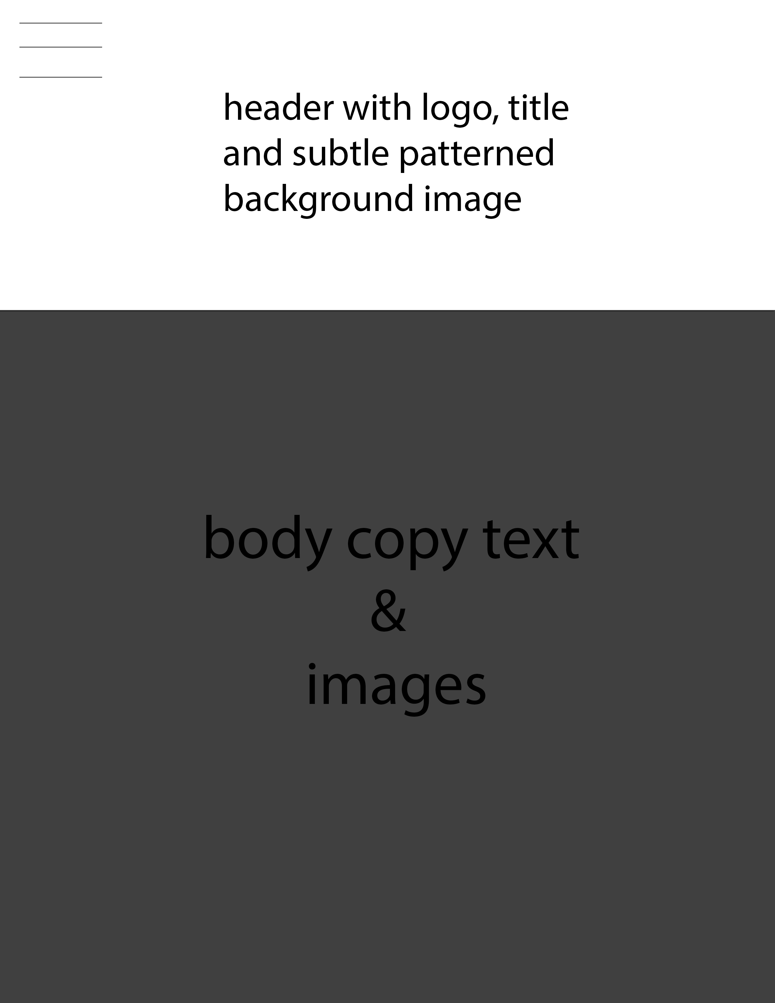
*Felicia's Wireframes
Desktop Wireframe

The creative elements I would use are: 1. the golden ratio to make the website look appealing to the eye 2. minimalism to make the page user friendly to navigate 3. a specific colour palette to convey the feel of the restaurant 4. specific fonts to go complement the colour palette chosen 5. images of food and things that go with this theme 6. subtle patterns so the page doesn't look flat and has some sort of depth. These elements working together should make the webpage entice customers to go to this specific restaurant to dine at.
Mobile Wireframe
